Archive for June, 2008

Typography

29 June 2008

The graphic design students who have joined our work experience programme so far have been taught little or no typography. This seems extraordinary, so Phil has written down some basic principles. Students are now being asked to design and set this text, and then print it on the proofing press. Here is what it says:

Six guidelines for good typography

The most important function of typography is to make the author’s message as clear and easy to read as possible. These guidelines will help.

Serifs help the eye move along the line, so serifed type is generally easier to read than sans serif.

Word spaces should be as small as possible, usually a thin, and visually even.

Word spaces should be reduced to accommodate sloping characters like W and Y.

There should be 10-12 words per line for optimum legibility. 

The visual space between lines should be greater than the visual space between words.

Words set in CAPITALS should be letterspaced for visual evenness.

Talk at the Art Workers Guild

29 June 2008

Last Thursday Phil gave a short talk at the Art Workers Guild on the printing of The Letterpress Shakespeare. Rosa had taken pictures of the production process, and they formed the basis of what he had to say. We have posted most of the pictures with brief descriptions here.

Article in Matrix

22 June 2008

The Whittington Press been publishing Matrix, its review for printers and bibliophiles, annually since 1980. Last year’s edition, number 27,  was delayed, and has just been sent to subscribers. We are pleased and honoured that it includes an article by Phil on The Letterpress Shakespeare with a tipped-in page from Hamlet, the first we printed. We have posted the text here.

New faces

16 June 2008

Rosa has gone to Italy for three weeks, and her place is being taken by her friend Luca Panzini. Luca was the our first work experience student last January. Like Rosa, he has just finished his second year studying graphic design at London Metropolitan University.

We are joined this week by Philippa Blood. She has just finished her graphic design course at Kingston University.

Work experience

10 June 2008

We introduced work experience placements at Hand & Eye only recently. They are intended mainly for students of graphic design, but are open to anyone who is interested. We generally offer a two week period.

Students learn the rudiments of hand typesetting and typography. They also observe and help with the everyday tasks of the press. These might include making up a forme, packing or running errands. They also have the opportunity to design and set their own business cards, which we print with them. We do not give payment.  

Please email us if you would like to apply.

A Greater Journey

1 June 2008

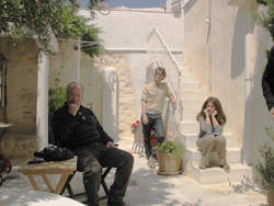
The Courtyard of the Aegean Center Last month Phil also went to the Greek island of Paros to visit The Aegean Center for the Fine Arts and its director John Pack.

He thought the Center was remarkable. Its students were learning the technical side of their art in a small group that was clearly open and supportive.

John asked Phil over to discuss a future collaboration. This autumn the Center will be publishing The Greater Journey, a book of John’s photographs and poems by Peter Abbs. Hand & Eye, we are very pleased to say, will be printing the text.